

Hudson Highlands Nature Center
Style Guide
logo / mini rebrand / style guide
view the full style guide as a pdf here
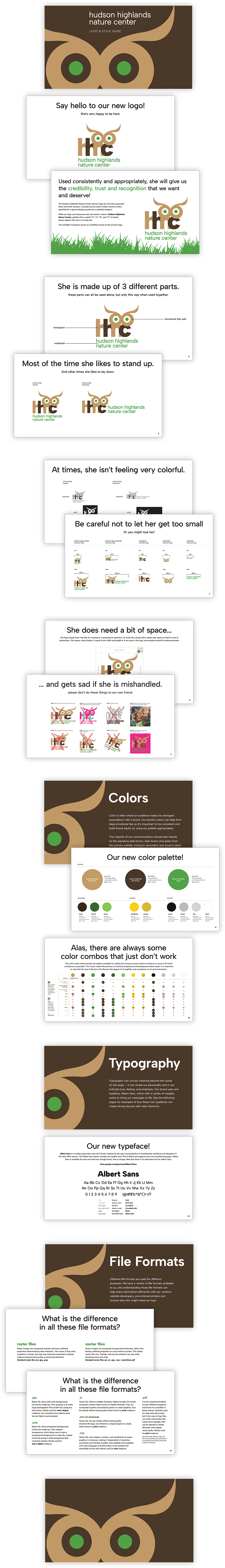
The Hudson Highlands Nature Center was undergoing a logo refresh and mini rebrand. While a style guide wasn’t part of the original request, I believe that whenever you create a logo for an organization, providing guidance is key to setting them up for success. I created a comprehensive style guide outlining the new fonts, colors, typography standards, and best practices for file usage and consistency.
To help them present themselves in the strongest way possible, I went beyond the basics—naming all brand colors, demonstrating best practices for typography, and even creating a full color matrix showing digital text combinations that meet contrast compliance standards. This made it easier for their team to produce accessible, polished materials with confidence.
I also incorporated a playful tone and a bit of humor throughout, so the information felt approachable rather than overwhelming. Clear guidelines are essential for building credibility and consistency, and when they’re presented in a friendly way, teams are much more likely to embrace them (and actually use them).
