Hudson Highlands Nature Center
logo / mini rebrand / style guide
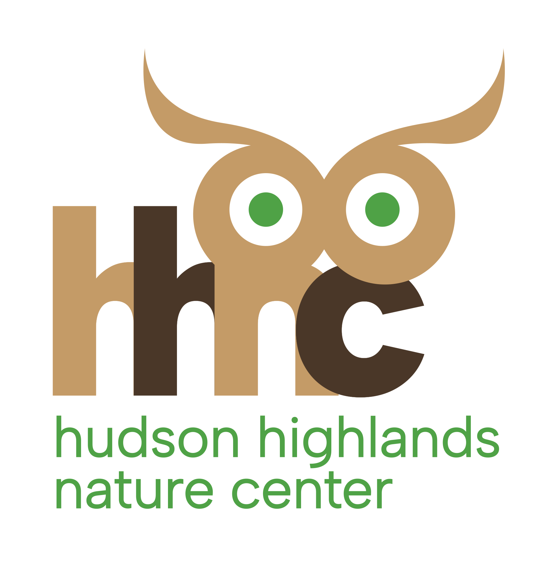
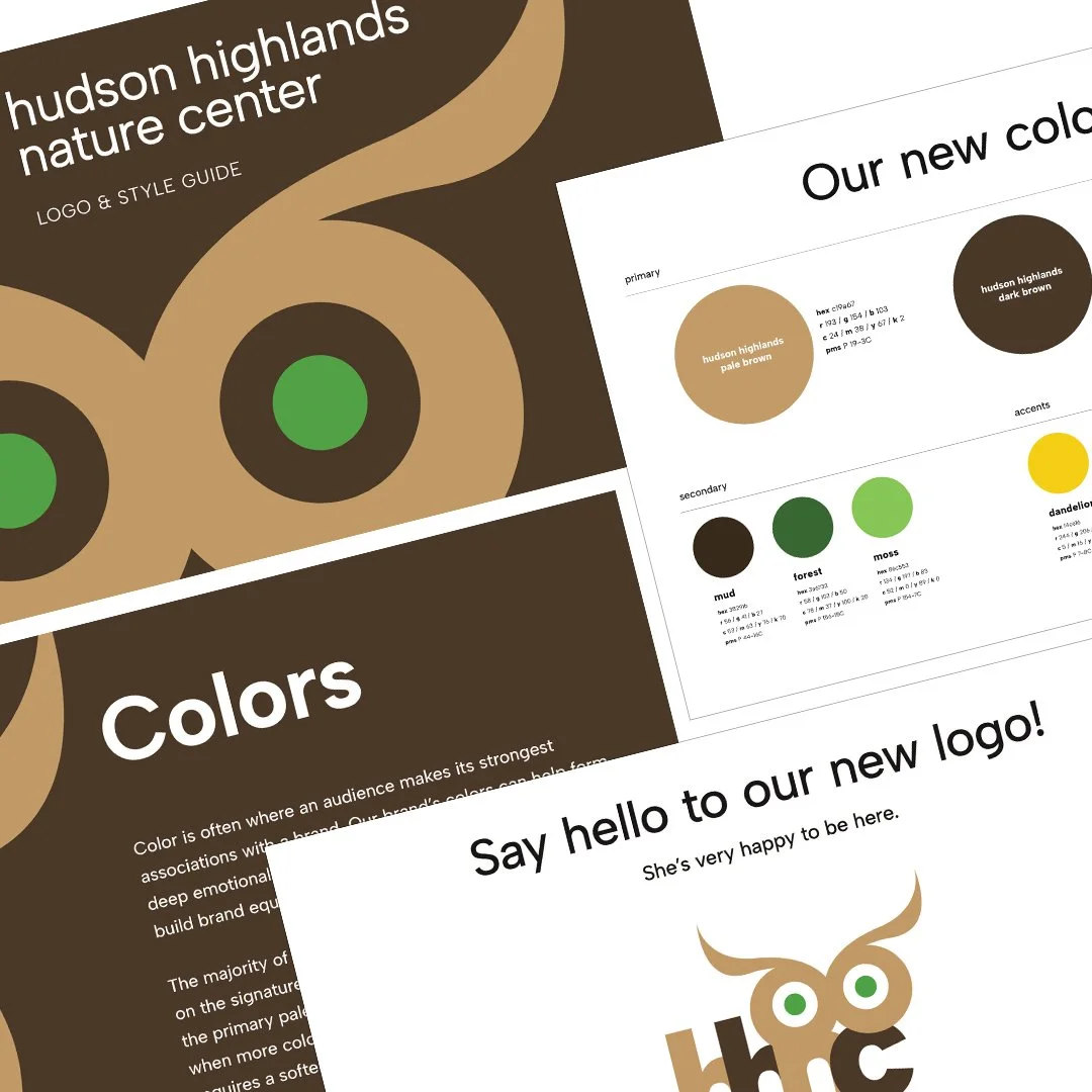
Hudson Highlands Nature Center needed a modern and approachable identity that could engage both parents and kids while reflecting the center’s mission of education and animal rehabilitation. The logo uses lowercase initials, hhnc, with abstract owl eyes perched above the letters. Negative space between the eyes forms a subtle beak, creating a playful and memorable mark that communicates intelligence and curiosity.
Letterforms, shapes, and proportions were carefully balanced to feel friendly yet grounded. The color palette and typography were thoughtfully curated to reinforce these choices, enhancing clarity, versatility, and the overall sense of intentionality across digital, print, and environmental applications. A compact style guide ensures the identity can be applied consistently and with purpose, supporting the broader brand voice. The result is a bold, versatile logo that is both distinctive and approachable, capturing the spirit of the nature center in a simple, clever design.