

Obsidian Consulting
logo & business identity system
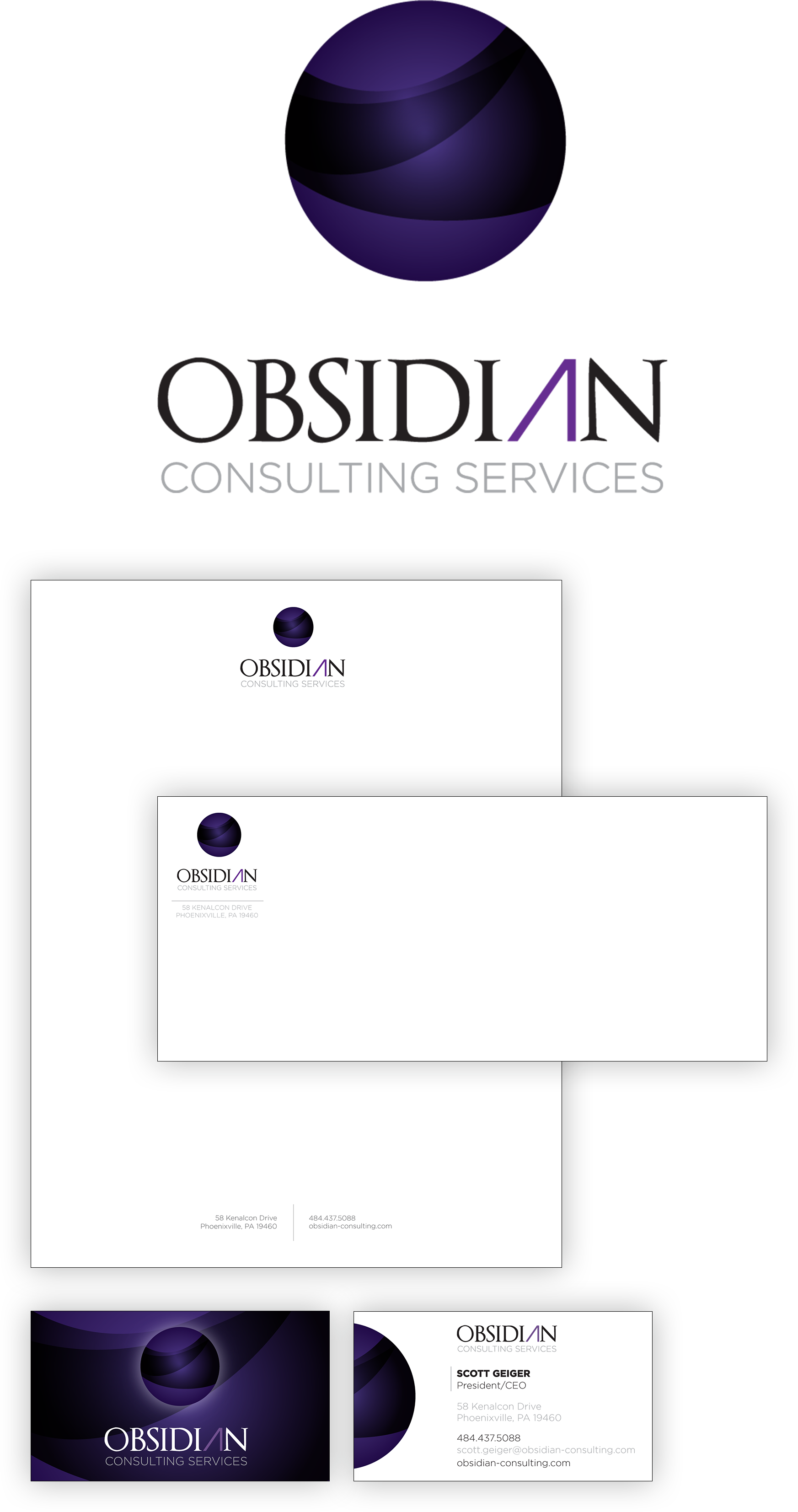
Obsidian Consulting Services needed a brand identity that felt polished, intelligent, and quietly powerful. Drawing subtle inspiration from obsidian, the volcanic glass known for its strength, depth, and reflective surface, the visual system centers around a dimensional sphere mark paired with refined typography to suggest clarity and forward momentum. A restrained palette of deep purples, black, and clean neutrals reinforces professionalism while adding distinction. Supporting collateral including stationery, business cards, and marketing materials extends the brand through thoughtful layout, intentional negative space, and consistent hierarchy. The result is a cohesive identity that presents Obsidian as confident and credible while maintaining a modern, visually engaging presence across all touchpoints.