

Town & Country Players
theater production logo
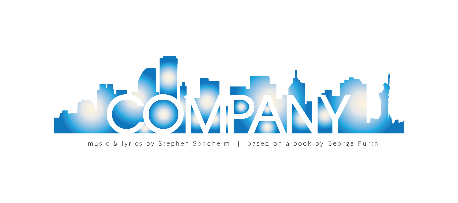
This logo for Town & Country Players’ production of Company combined typographic creativity with visual storytelling to create a high-end yet approachable identity for the show. Inspired by the New York City skyline central to the narrative, knockout type was layered over a stylized skyline rendered in shades of blue, with subtle glows of light suggesting the vibrancy and energy of the city at night. The design balanced sophistication and accessibility, reflecting the personality of a small theater company while giving the production a polished, professional presence. Typography, color, and composition were strategically applied to create visual hierarchy, enhance legibility, and convey atmosphere.
The logo illustrates how thoughtful design can translate narrative and tone into a compact, memorable visual identity, highlighting the integration of typographic treatment, color strategy, and conceptual reference in high-impact theatrical branding.